Thursday, 12 August 2010

Logo

As it is all aimed at males,
we spent a few conversations wondering whether we should change the logo,
and in the end we decided no, because it may have been to much or effected the brand on a whole.

But I decided to add to it to see how it would work,
I decided to turn the logo into a male gender logo,
I feel it worked pretty well and tried it on all the designs, and I feel it works maybe just not aswell with the text,
so decided to try mixing the both.

Favourites

From the selection of 18 we produced as a team,
my favourite always was the images below,
I tried it using all the possible I have put together,
Its works really well and I am happy with how this selected one has worked out.


Just New Logo

As Marc took a few example images,
I thought I should put in my share by putting together some edits on the images we took,
trying a new logo that I put together to aim Bacardi at males.

I think they look good, and neat and professional,
but nothing compared to how good it looks while using the existing logo and text.


Bottle & Logo

On a personal view I think the whole ideas look tacky,
I love the image but using both the logo and bottle makes the design look fake and unreal.

Using the logo works,
but the bottle is ruining it and making it look unprofessional.


With Bottle

I tried to see how the posters would work without using the Bacardi logo or type,
and just using there famous bottle.

But to be honest I don't feel it works at all,
I reckon the designs as a whole all look better without the bottle and works better with either the logo or text, or both them,
But the bottle just doesn't work on its own.


Wednesday, 11 August 2010

Packaging Layouts

When we kicked started the brief we thought it would be a good idea to design a appealing packaging for the Bacardi bottle,
something that would look good on the shelves of supermarkets or a off license.

At this point we where kind of ignoring the brief, with the fact that it was meant to be aimed at males, promoting it,
we where just designing something that was appealing for both male and female.


We explored with plenty of ideas, and different ways the box can be constructed to open and close,
what would be in the box, how it would all fit in,
but after the first crit we where persuaded out of doing it and taking a different and much more stronger approach.

Posters Idea

We finally decided we where going to focus on a poster campaign for the brief,
design sets of posters that could be used in bars, bus shelters, billboards etc.

We want the simplicity but appealing approach towards them.


I came up with the idea of tweeking the Bacardi logo a little,
turning the circled logo into the male gender symbol,
and also working with it as a cocktail stick.


I messed about with a good few ideas and designs on how I could make this work,
positioning of the logo, text and image, wanted to make it look dark and more in the shadows.


We felt we finally hit the jackpot when we thought of a man thing to do is, TOOLS/DIY.
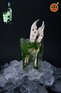
So we put down alot of ideas and decided the resolutions where going to be a image of a Mojito, surrounded by tools, Hammers, Spanners, Knives etc.

We replaced the cocktail still with a screw driver,
and the ice was crunched with a clamp, lime cut with a scalpel, and just surrounding the image with extra tools,
we felt this would be a strong idea, and moved on to the resolutions.

Ident Layout

As well as the packaging idea we brainstormed the idea of doing a ident/advertisement,
as the module before we where using Adobe After Effect, so we felt we could take this route if we chose,
but we would have been using it as a back up with some other designs.


As it was aimed at fellas, we took on the idea of it all being about sports and women,
Example being, one minute to fella drinking in a bar, they both order a Bacardi Mojito and they are still in the bar, looking a dressed women,
and they take a drink and it starts slowly changing, and they drink more and it continues to change, and when they finish the drink they are on a beach with a load of men and women dressed in summer wear.

The ideas where there but we just wondered if it would have been possible for us to do it,
and if so, would we be able to produce it aswell as we had on paper and in our heads.

We didn't end up going through with the idea of a ident, but we did look alot into it.