Sunday 25 July 2010

Book Design Layouts

Aswell as doing all the designing for the logos and symbols for the book,
The most important part of the designs, if actually designing the book.
Making sure the composition is right, and everything that is needed is also there.


I messed about with alot of layout, trying the find what would be best,
I knew I want to keep it basic and simple due to the time I had to have the book designed and created,
I wanted to use a flat, bold colours for the resolutions,
So then started messing about with what should be where, and why it is best,
I came up with 10 strong layout designs, and then brought 4 of them forward and used as final options.


These are just a few layouts where I put the colours on paper to see how they could look,
But I had already decided on colour with information I found whilst researching,
which you can see on a other blog.

Sets of Books

For my brief I am designing a set of books,
and I was looking through my own book collection and a few over the internet,
looking at book covers that work as a set, and looking at the relationships between them.

Over a personal view,
I know you should never judge a book by its cover,
but I think a book should always look appealing no matter what is on the
inside.

Below are a few sets of books that I found, some famous which everyone would see,
and others that people may not recognise;

Starting with my favourite author Charles Bukowki,
the designs of his books appeal to me, with these you should judge a book by its cover.


I love the designs on these books,
the colours and contrast used on each book so they all work,
and although none of them have the same images, and some have totally different colours,
you can still notice they are a set.

The images used for the books, match the story of the book perfectly,
these are the most dated covers from these books, so the designer has had the chance to read the book and focus the covers using scraps from the actual story.

Different typefaces used to separate the title and the author,
but once these where selected they are used through the set of books.

As well the set above, Bukowski has had other designers working on his work,
with the two below;


The set above are just alot more simple than the other, just using bold colours,
based on shapes and patterns,
this is more the approach I would like to take for my set of books, plain and bold.

Jack Kerouac Book;


The person who designs Jack Kerouac books, seem to keep it simple,
this is the type of design I enjoy looking at, a simple image, supported by text across.
Selecting the right typeface to match the image is a big decision,
you have to get it right to make it work, and even more a set of images to make
the set of books work.

With these Kerouac set, the images have been transformed to black and white and the contrast has been set,
and like the Bukowski books, the type has been chosen and used across all set of books.

Also like Bukowski, there are other designs for others of his books,


Aswell as the set above, these are also just image with selected typefaces.
But using colour images and alot more bold text.
Text positioned in the same place with the image working around it.

Desiging My Logos, Layout

Designing a logo is hard,
you have to put a minimum of 50 different ideas down to have such a wide choice,
not 50 different tweeks from same logo, 50 total different designs,
here are a few layout I put together to get to my chosen design;


I spent the first few layouts and designs focusing on using a open book, or using the "B"
And seeing how they could turn out, and then continued experimenting along them lines,
blacking them out,
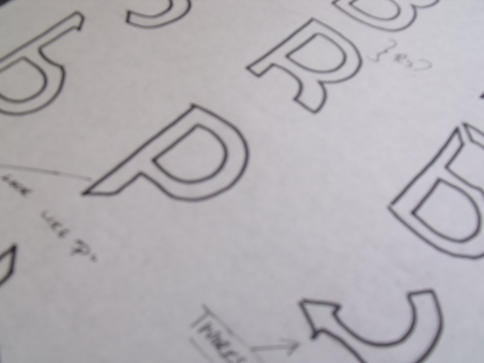
boxing and circling them, just messing about with different ways to see how they looked,
I think they looked good, but could have done with improvement, so obviously continued to design and mess about with other ideas.


I came up with the idea of mixing the book and the B together, but I could get them to work very well,
I felt I was putting to much in the design and I just wanted it to be simply, but simple that it stands out.


I came across these design that I put together, doing what it was I wanted and mixing the B and book together, but in a more bold and simple way,
nothing complicated and so it was easier and appealing toward a audience.


I started using other shapes and seeing how that panned out for the design,
example using the heart with the idea of, Love Books?
Feel they could work, but not what I was looking for with the designs for the publishing company.


Tried using fancy designs but the wasn't really working out for the idea of the company.


Once again was messing with different shapes, have the shapes so when they where put together they made the letter B, as ever some worked alot stronger than other, and some where pretty weak.
Also started using the letter B, and dissecting, removing pieces, seeing how far I could go before it wasn't able to be read.


I cam across the idea of using a open, but viewing it from its side, and then messing about with ideas, to see if you then rotated it 90% did it read as a B,
It did, just needed some tweeking, I really liked this idea, coming across it.
It was put forward as one of my resolution options.


I once again tried the fancy curvy style,
I personally feel they where nice, and looked appealing, but I felt I had already came up with stringer designs throughout the layouts.