Thursday 30 September 2010

Olly Moss

More of Olly Moss's work, nothing to do with film posters,
but the same simple but effective approach I want to take for my movie posters.


The Evil Dead_ This is alot more cramped that how he usually works, but still has the same effect,
Still using the detailed outline to good effect.


Stay Sharpe_ This designed was also released as a t-shirt as you can see above,
same colour pallet used for the film posters, and same approach.


Make Something Cool_ More of a colour pallet than usually used, often he sticks to 2-3 colours, but he has expanded on this approach, and used the colours to good effect.


Lost_ Alot more detail used in this poster than you usually suspect from Olly Moss, but still kept simple and neat and appealing on the eye. Once again limited colour pallet. Although there are alot of images used in this piece he has stuck to his style of illustrations.


Black Keys_ Black Keys are a personal favourite band, and when I seen this I was shocked to see he had done a piece for the band, I really like what he has done, I think the idea is really clever. Once again sticking to his simplicity.


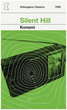
Looking through Olly Moss's work over the last few days, he has grown and grown on me, I love the simplicity of his work, keeps it simply yet effective.
Looking though his work also made me realise you can do some great work with a limited colour pallet, don't need to just throw colours everywhere all the time.

Olly Moss, Computer Games Posters

More Olly Moss work,
this time it is moved away from movie posters and this is based on computer games.
But still he sticks to the simple and effective designs, not using to much, just keeping them simple.


Metal Gear Solid_ Simple block design, cold colours, cigarette being replaced by a explination mark! Simple for effective.


GTA_ This is a personal favourite, I am a huge GTA fan and I like how he has took the star police rating from the game, and put that idea on to the American flag, placing the 50 stars.


Golden Eye_ Same image used 4 times, but just a minor replacement, but even little things like that make his designs stand out and work really well.


Call of Duty_ I like this one with the reason being, out of the set it is the only one using a photograph but it still has the same effect with the others, doesn't stand out or look out of place, just fits in with the rest.

Once again for the designs of these he has stuck to a colour pallet that sees fit, focusing on bold colours that stand out.

I think to understand the designs on the covers, you have to played the games, personally I understand them all but there will be people who don't but still appreciate the simple and effective design.

Along with that, simple addictions such as, in the top corner it has a symbol of what console it works on, and I like how it has the date the game was released.

Olly Moss, Red & Black

As well as the Rolling Road Show he also produced more movie posters for "Films In Red & Black"

These are along the same lines as The Rolling Road Show, limited colour pallet,
Simple, but effective designs.


The Great Director_ Simplicity is the key, and with this it is a very simple design but clever, as it can be rotated and still be an image.


Taxi Driver_ This is another personal favourite, a symmetric image, being used to full fill the page but in a effective way to draw in the audience, along with the word Driver being backwards to help to the symmetry of the design.


Rain Man_ Out of all the designs I have seen of his, this is the one that doesn't appeal as much to me, there is alot more in this design that all the other, and I have became a fan of the simplicity of his work.


American History X_ Out of the selection this is a personal favourite, the image mixes in with the title in a clever way, he has took the same approach as he does with alot of his work and just keeping it simple.

To understand some of the designs you have had to of seen the movies,
he takes an approach of designing based on scenes in the movie, which is something I should maybe take on board.

Olly Moss, Movie Posters

Olly Moss, is a personal favourite designer, and whilst browsing on his website I found a couple of movie posters he had designed based on movies that where already realised years ago.
Myself, intend on putting together a brief based on movie posters, for a movie marathon based on a certain director, director TBC.

The idea is to produce 6-7 posters for the marathon, one for each of the movies that will be shown in the cinemas,
and to also put together an booklet about the upcoming event.

Back on to Olly Moss,
The posters I viewed on his website are the design direction I want to take for mine,
below are a load of posters he put together, a set of work named "The Rolling Road Show"


There Will Be Blood_ A simple detailed outline filled in, bas in black and the sky red, he makes the simple designs stand out, but have a large impact.


Robocop_ Out of the set, this is my favourite of the selection, the simple clever design just makes the design look so effective, and using the bold flat black to make shadows, with light coming in taken up by the beige and red.


On the Waterfront_ This is abit different to the other designs as it is and actual image of a person and not an outline, but it still has the same effect as the others in the set,
colour pallet has a big part to do with this.


Dirty Harry_ I like how clever he has been with the design of the gun, being shaped around the face. Simple but effective.


Convoy_ The simpleness of the design, a tyre track but if you look closer it is a van and other items, just simple design but very clever like alot of these movie posters.


I really like how he uses just a selected colour pallet, in this case he use just Black, Red & Beige.

Negotiated Briefs

On the whole I wrote myself 14 briefs, which I am trying to get down to 10,
either combining or just getting rid of some and then doing them in my own time.

Briefs_

10 Things You Should Know,
Design a book/magazine which represents "10 Things You Should Know"

Through The Decades,
Produce 6 A2-A1 posters representing how times have changed over the last 5 decades.

Newspaper Design,
Design a 20-30 page newspaper
or
Design 3 10 page newspapers.

Designing For A Music Artist,
Produce a range of items that a band would need to start promoting them selves and getting them selves known.

Magazine Design,
Produce a 20-30 page magazine, of a topic of your choice.

Film Posters,
Design a set of 6-7 posters advertising the movies coming back to the cinema for one time only, in a way that you see fit.

Famous Quotes,
Produce a number of A2-A1 posters representing famous film quotes.

Exhibition,
Design the promotional items to get a design exhibition out in the open so people would know about the show, and would attend.

Coffee Shop,
ReBrand the whole coffee shop,
Promotional items to get the word across.
Inside the shop and outside the shop design.

25 Things You Should Know On A Graphic Design Course,
Produce a book aimed at people looking into attending a Graphic Design course.

Adidas,
Design a set of 5-6 posters advertising Adidas, in what way you see fit.

Alcohol Addition,
Produce two larger than A1 posters advertising against alcohol addiction.

Argue For You Ears,
Produce a minimum of 4 posters arguing there point on why they should be the best system to listen to your music on.

Set Of Books,
Design a set of books and promotional items based on a topic of you choice.

Some of these I feel I could combine, to lower the amount of briefs.
The brief in bold are the brief I am focusing on for this module.
As well as these we have to do a competition brief.

Group Task

We where asked to write two lists with a minimum of 5 answers,
With what we want during the year and what we don't want to do throughout the year.

Want_
Image & Photography.
Work with promotional material.
Magazine & Layout.
Collaborate, preferably with a photographer.
Screen print.

Others that I wrote but didn't put into the 5 where,
Have a good/solid year.
Design language, pitching ideas and designs.
Website, need to get my online presence.
Placement/Industry Experience


Don't_
After Effects.
Leave with a portfolio I am unhappy with.
Websites, would like to design them, just not put them together and make them function.
Font design.
Illustration.

We also had to write a maximum of 20 words describing who we are as a designer;
DESIGN PRINT BASED PROMOTIONAL MATERIAL FOR HIGH END COMPANIES.
FOCUSING ON USE OF IMAGE/PHOTOGRAPHY.

After we had these, we where put into groups to talk about these,
I was put in a group with,
Marc, Ben, Anna, Luke, Leigh.

Between us we had to make three list, Practice, Context, Progression.
Putting in our wants and needs into them lists.

Practice_ Want_
Book making.
Screen print.
Info graphics.
High end for print.
Collaboration with other courses.
Comic books.
Collage style.
Photography.
Illustrate.
Studio experience.
Layout.

Practice_Need_
Identity.
Web presence.
Presentation skills.
Neat portfolio.
Understanding of screen, web and type skills.
Presence.
Wide skill based.
Confidence with your work.
Take risks.


Context_Want_
Design terminology in crits.
Professionalism.
Value & ethics, own.
Placement, studio and visits.
Galleries and shows.
Dealing with other industries dealing with design.

Context_Need_
Understanding of theories.
Dissertation.
Industry awareness.
Trends and fashions in design.


Progression_Want_
Feedback from professionals.
Placement/experience.
Freelance work before we leave.
Networking.
Studio experience.
Time management.
Live Briefs.

Progression_Need_
Portfolio.
Collaboration.
Cliental.
Identity & web.
Time management.
Peruse people & companies.
Planning & organisation/
Take risks.
Keep up to date with new software.

After this we had to read out our Wants and Don't wants for the year,
then the group asked that person questions, but they could not answer,
my questions where_

_ Screen Print, find briefs that I can use.
_ Combine Zeens.
_ Link photography and screen print, experiment.
_ High end companies & screen printing, will this work? Careful with company/brands.
_ Typography, do a short brief, get back into it? Don't just push it away.

On the whole I feel this session was really helpful,
from this it helped me clear up what I could do for my briefs, as after I annotated them all, and everything seems to be that bit more clear to me.
As I have written 14 briefs I feel I could nail that down to 10.

Start of Level 06

So the summer is over, and its time to get down and dirty with design.

The final year is upon us and now there is no time for messing and slacking, as of the last two years, Confession.
I know I need to get myself organised and ready for the year, as I ain't been the best the last two year, I feel I have something to prove, need to start boosting up my portfolio as it is lacking with designs I am happy with.

On to the first briefing,
22.09.2010_
Straight back into action, an all day brief, going over the briefs,
what will happen during the year,
looking into the time table for the year.
and so on and so on.

A first mini task we where given was to make a list of what we want to get out of the year and what we need_

Want_
Good/Solid portfolio
Placement/Experience
Presentation skills
Design language
Confidence in myself and work
End of course job/employment
Good final grade
Use photography/image more
Get in touch with more industries and designers
Free Lance?
Screen print

Need_
Get my act together
Make earlier decisions
Time Management
Organisation
Find out what designer I am
Use studio space more
Good amount of work
Good/Solid resolutions
Promote myself more, online presence and personal idenity
Work on design language
Briefs to best possible
Pass dissertation on first attempt, less to do during FMP

There is alot of wants and needs, but that is something I will have to work realy hard on within the year.


.