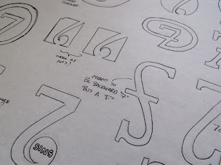
Along with the Buks logo I had to get a load of ideas out there,
experimenting with different typefaces, composition and trying to make it appealing to the eyes,
I put together alot of layout, just getting all my ideas out of my head on paper,
and below here they are;


The images above are me just experimenting with different typefaces,
before expanding on them, add and subtracting bits and bobs.


I came up with a few different layouts for the logo, expanding the decenders and ascenders and the crossbars,
once I had a few ideas down, was 14 in total, I experimented the same ideas with different typefaces.
When I got the 7, and was messing about with it,
I started adding bits, and came with up with the ideas above, that could possibly work out to be a 7 & S, but it came in the order of S7, and personally I thought it looked alot more like a sports advertisement.
Simply messing about with some shapes, or using the space around the 7 and seeing if that works, some worked, but not a strong appealing idea that I want for my logo.
Then I started experiment with positioning and getting more excitement out of the designs, then I finally for my final idea which you can see on my finished designs and on a further blog.


No comments:
Post a Comment